Illustration, Case Study
Merging Music and Vitals:
A Spotify C.UI
Music does a lot to enhance the experience of physical activity. Whenever I jog, I always pop in my headphones and match my pace and heart rate with the high bpm of the EDM that I love. Using Spotify on my smartwatch is convenient during runs, but the small interface makes it cumbersome to interact with.
Inspired by these experiences, I and a team of designer-friends envisioned Spotify x C.UI, a conversational interface that surfaces songs based on users’ music preferences as well as their current activity levels.
with Zoe Lehn and Liam Van Oort.
Spotify C.UI is a 3-week vision project that combined the metrics of smartwatches with the listening data collected by Spotify. My team shared the roles of motion design, concept development, and storyboarding.

Our first step was research. It can be easy to let our experiences form the backbone of our design, but we needed to let our assumptions go and have chats with other smartwatch and Spotify users.


A Smartwatch Listening Experience
For us, the immediate opportunity was in the space of interaction—the small, tactile-based menus of our Apple Watches were always frustrating to navigate through. An epiphany struck, and we soon recognized that the fitness-related data gathered by smartwatches gave our C.UI an entirely new meaning.
Just asking about how a user taps a watch wasn’t enough. For example, we found that high-intensity activity lead to a handful of sweat-covered touchscreens and high BPM songs blaring out of headphones.
We prototyped movements in responses to emotional states. With only simple transformations in scale and opacity, we created a survey of simple shapes expressing feelings like optimism and urgency.
Emotions in Motion
Mapping out the explorations we developed gave us a foundation for where a Spotify C.UI’s personality might stand. We took what we learned from these one-offs and merged them with our survey of Spotify’s brand and product services.
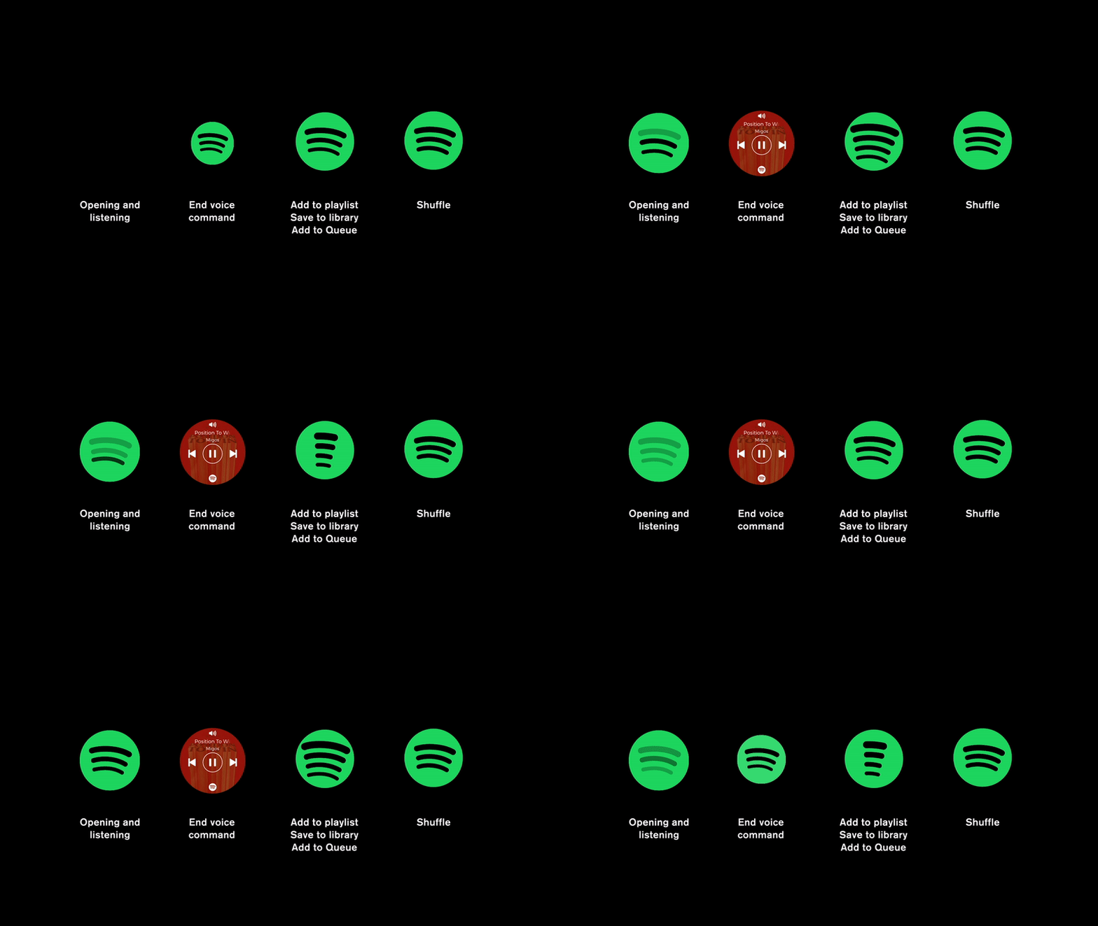
We then mass-listed commands that a user might give when using a Spotify C.UI. From “Shuffle my playlist” to “Skip this Song” we needed to understand the variety of use cases that the C.UI might encounter.


It turns out that many commands were pretty similar, so we were able to reduce the amount of movements our C.UI would have to produce. From here, we moved full steam into wrapping it up with a story.
